
Bfgrn
New member
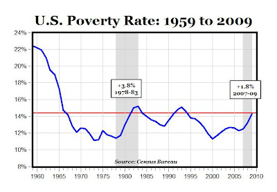
Based on the graph you posted prior it showed (I believe) a 15% poverty rate when the War on Poverty legislation was passed and a 15% poverty rate today. I'm not sure how we would judge improvement but those are the numbers.
As far as what the legislation proposed to do I think we almost all can agree that what legislation proposes or claims it will do often turns out different than what it actually does.
The chart I posted came from the Freak's link
I went to the site Freak got the chart from, it is the blog of Mark J. Perry from the American Enterprise Institute, a right wing think tank. The same AEI that fired former G.W. Bush speechwriter David Frum for telling the truth about Republicans during the health care debate.
Directly below the chart, Perry posted:
According to the recent Census Bureau report
BUT, when you go to that Census report Perry linked to, there is a DIFFERENT chart...

")